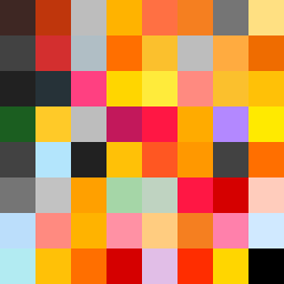
Square Project artwork
Conflict of Perception
confusion vs clarity; symmetry_vs_break; falling_pixels; pulse; crosshatch against noise; thick_outline; symmetrical_vs_broken; tiny_face; rage_calm | abstract variation request 102; target batch count 200
- Grid
- 8 x 8
- Cells
- 64
- Colors
- 47
- Record
- 2530065f
Artist Statement
The emotional tone reflects a struggle between clarity and confusion, mirrored in the choice of contrasting colors. The palette of burnt orange, dark red, charcoal, and gold symbolizes a heated turmoil contrasted by moments of clarity. The thick outlines represent a sense of frustration or interruption, while the checker pattern evokes confusion, disrupted by patches of clearer colors to signify moments of clarity. The arrangement gives a pulse-like rhythm from left to right, emphasizing the transition from chaotic to structured, showcasing the collision between the two opposing feelings.