Square Project artwork
Exposure vs Shelter
vulnerability vs strength; symmetry_vs_break; cross_current; braid; flood against stack; pressure_border; fast_vs_slow; tiny_face; desire_emptiness | abstract variation request 293; target batch count 500
- Grid
- 8 x 8
- Cells
- 64
- Colors
- 64
- Record
- 237121e6
Artist Statement
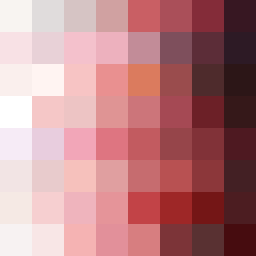
The emotional tone reflects the push-pull dynamic between vulnerability and strength through contrasting colors. The palette combines soft tones of off-white and faint peach, signaling vulnerability, against deeper, compressed reds and dark navy hues symbolizing strength. The main contrast occurs in the central row where pale colors interrupt more saturated tones, creating a visual echo that embodies a fragile defense against the overwhelming pressure of the surrounding hues. The layout features stacked bands, suggesting a shift in density and emotional temperature, while intentional broken pixels introduce disruption, mirroring the complexities of the emotional state defined by the seed.