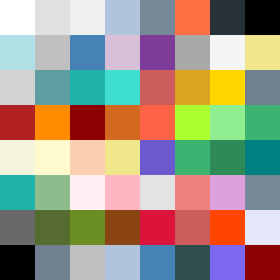
Square Project artwork
Exposure vs Shelter
vulnerability vs strength; symmetry_vs_break; cross_current; braid; flood against stack; pressure_border; fast_vs_slow; tiny_face; desire_emptiness | abstract variation request 202; target batch count 500
- Grid
- 8 x 8
- Cells
- 64
- Colors
- 53
- Record
- 235d4f6a
Artist Statement
The emotional tone is rooted in the tension between vulnerability and strength. The palette of clean white, ice blue, ink black, violet gray, and warning orange creates a stark contrast, embodying the tension between exposed light and the severity of dark edges. The collision occurs predominantly in the center with a chaotic interplay of broken pixels disrupting the order, symbolizing emotional leaks and unshielded spaces. The layout reflects a near-complete frame, with breaks showcasing vulnerabilities. The design captures a story of resilience and fragility, allowing quiet fields of color to balance against accentuating disturbances, encapsulating the essence of the seed.