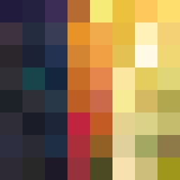
Square Project artwork
Contrast of Hope and Fear
fear vs hope; light_vs_weight; split_vertical; burst; crosshatch against mirror; glowing_edges; straight_vs_curved; door; machine_emotion | abstract variation request 91; target batch count 200
- Grid
- 8 x 8
- Cells
- 64
- Colors
- 64
- Record
- 20edb3b2
Artist Statement
This piece embodies the emotional tension between fear and hope through a dynamic interplay of color and pattern. The chosen palette of dark violet, soft gold, and pale green resonates with the themes—dark hues represent fear’s weight and pressure, while the bright accents of soft gold symbolize hope and the possibility of light. The layout intentionally splits the canvas vertically, with one side dominated by a dense pattern resembling cracks (fear), in contrast to a more luminous and sparse arrangement that evokes a sense of rising (hope). The collision occurs in the center, where jagged edges of darkness clash with glowing, softer colors, portraying a narrative of struggle yet potential release. Strategically introduced broken pixels accentuate imperfection, echoing a sense of vulnerability amidst the tension.