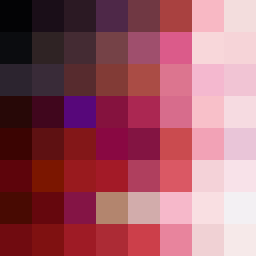
Square Project artwork
Exposure vs Shelter
vulnerability vs strength; symmetry_vs_break; cross_current; braid; flood against stack; pressure_border; fast_vs_slow; tiny_face; desire_emptiness | abstract variation request 323; target batch count 500
- Grid
- 8 x 8
- Cells
- 64
- Colors
- 64
- Record
- 20866eeb
Artist Statement
The emotional tone contrasts vulnerability's thin shell against strength's dense base, illustrated through soft pale colors enveloped in deep maroon and punctuated with gray accents. The palette of pink, red, gray, and dark maroon enhances the emotional depth, creating a delicate tension. The arrangement features a central dense area that contrasts with lighter, more exposed colors around it, embodying the seed's theme of collision between safety and exposure. The main collision is at the center, where darker shades encapsulate lighter ones, suggesting an ongoing battle between structure and fragility. This abstract pattern invites reflection on moments of emotional pressure framed within the vulnerabilities we navigate.