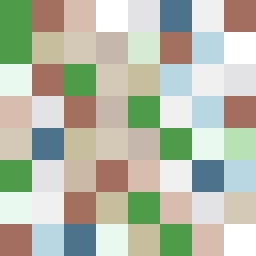
Square Project artwork
Exposure vs. Shelter
safety vs exposure; pressure_vs_release; split_vertical; echo_right; braid against ripple; pressure_border; thin_vs_heavy; vessel; softness_severity | abstract variation request 180; target batch count 500
- Grid
- 8 x 8
- Cells
- 64
- Colors
- 16
- Record
- 2071aa0b
Artist Statement
The emotional tone mixes warmth and vulnerability, illustrated by the contrast between soft, muted greens and browns representing safety, and cold whites and pale colors symbolizing exposure. The layout of the open gate allows for an inviting yet fragmented flow. The patterns juxtapose a structured grid against a ladder-like openness, where the main contrast collides at the center, enabling a feeling of conflicting emotions. Broken pixels introduce intentional disruptions, representing the imperfections inherent in the concepts of safety and exposure.