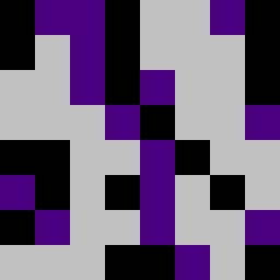
Square Project artwork
Contrast in Emotion
envy vs gratitude; center_vs_edges; empty_room; outside_inward; noise against crack; soft_edges; rising_vs_falling; tear; fear_hope | abstract variation request 3; target batch count 200
- Grid
- 8 x 8
- Cells
- 64
- Colors
- 3
- Record
- 1fdfb4c5
Artist Statement
The emotional tone reflects a struggle between opposites—envy and gratitude. The chosen palette of black, dark violet, soft gold, and pale green embodies these feelings, where black and dark violet represent the weight of envy, while soft gold and pale green offer a sense of hope and gratitude. There's a dense vs. empty contrast in the arrangement, with softer edges gradually rising toward the center, echoing the tension between rising hope and falling fear. Unbalanced placements create interruptions, suggesting the imperfections in human emotions. The central layout captures an almost mirrored image, disrupted by a few 'broken' pixels, symbolizing cracks in perception, thus maintaining the abstract theme without literal representation.