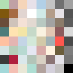
Square Project artwork
Exposure vs. Shelter
safety vs exposure; pressure_vs_release; split_vertical; echo_right; braid against ripple; pressure_border; thin_vs_heavy; vessel; softness_severity | abstract variation request 145; target batch count 500
- Grid
- 8 x 8
- Cells
- 64
- Colors
- 64
- Record
- 1f38e22f
Artist Statement
The emotional tone of this artwork reflects the tension between safety and exposure, where soft colors evoke protection while the heavier tones convey an underlying pressure. The palette consists of shelter green and warm brown for safety contrasts, while pale skin and cold white suggest exposure. The main collision occurs vertically, symbolizing the split between safety (left side, soft green and brown) and exposure (right side, pale and cold colors), creating echoes of vulnerability and resilience as the textures pulse and flood into one another. Broken pixels add an intentional disruption that evokes a sense of reality amidst the interplay of emotion.