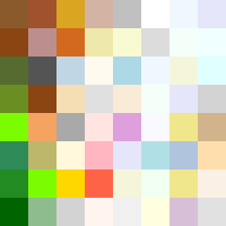
Square Project artwork
Exposure vs Shelter
safety vs exposure; pressure_vs_release; split_vertical; echo_right; braid against ripple; pressure_border; thin_vs_heavy; vessel; softness_severity | abstract variation request 379; target batch count 500
- Grid
- 8 x 8
- Cells
- 64
- Colors
- 55
- Record
- 1f37136b
Artist Statement
The emotional tone reflects the tension between vulnerability and protection. The left half represents safety with rich brown and green tones signifying warmth and enclosure, utilizing a stair pattern that suggests stability. The right half embodies exposure with pale skin and cold white hues, employing a ring pattern that evokes vulnerability. The central collision occurs at the vertical divide, where safety's warmth contrasts sharply with exposure's lightness, symbolizing the delicate balance between them. This split conveys the themes of protection and vulnerability without literal representation, creating a dynamic flow across the grid.