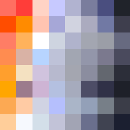
Square Project artwork
Conflict of Elements
vulnerability vs strength; exposure_vs_shelter; rising_signal; outside_inward; flood against spark; hard_edges; thin_vs_heavy; tiny_plus; connection_alienation | abstract variation request 364; target batch count 500
- Grid
- 8 x 8
- Cells
- 64
- Colors
- 64
- Record
- 1f3048c4
Artist Statement
The emotional tone reflects the interplay between vulnerability and strength, capturing the tension of exposure against the armor of shelter. The palette is vibrant yet muted to symbolize the fluctuating feelings—hot coral and blood orange represent strength, while the softer dust pink offers vulnerability. The contrasting edges created by dark charcoal provide a strong boundary while allowing the softer colors to spill inwards, suggesting a push and pull between safety and exposure. The layout features a dense 'island' of vibrant colors surrounded by cooler tones, creating a sense of space and quiet around the energetic center, stressing the theme of inner conflict and external pressure.