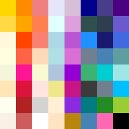
Square Project artwork
Exposure vs Shelter
vulnerability vs strength; symmetry_vs_break; cross_current; braid; flood against stack; pressure_border; fast_vs_slow; tiny_face; desire_emptiness | abstract variation request 438; target batch count 500
- Grid
- 8 x 8
- Cells
- 64
- Colors
- 62
- Record
- 1e1b677e
Artist Statement
This piece contrasts vulnerability with strength, showcasing a pale core surrounded by deeper, more assertive colors to encapsulate protection versus exposure. The selected colors from the 'joy_grief' palette reflect the emotional tussle between warmth and coolness, employing yellows and oranges as buoyant yet delicate tones, while deep blue and muted purple ground the composition, symbolizing weight and resilience. The interplay between the warm inner colors that represent hope and the cooler border colors signify an emotional barrier or frame. Broken pixels create an imperfect edge, amplifying the tension leading to both vulnerability and strength. The collision of warm and cool colors primarily occurs in the center, where the lighter colors appear fragile against the stronger, darker surroundings, illustrating the fragility of hope against the weight of reality.