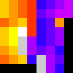
Square Project artwork
Tension of Opposites
vulnerability vs strength; exposure_vs_shelter; rising_signal; outside_inward; flood against spark; hard_edges; thin_vs_heavy; tiny_plus; connection_alienation | abstract variation request 289; target batch count 500
- Grid
- 8 x 8
- Cells
- 64
- Colors
- 13
- Record
- 1d23302e
Artist Statement
The emotional tone reflects a struggle between vulnerability and strength, embodied in the interplay of colors. The palette features warm orange and yellow for strength, contrasting with cool deep blue and muted purple representing vulnerability. The collision occurs in the center, with a dense focus on warm tones surrounded by the cool, creating a visual tension that narrates the abstract story of exposure and protection. Broken pixels introduce imperfection and chaos, symbolizing the messiness of emotions, while the layout centers the struggle in an asymmetrical fashion, enhancing the emotional weight.