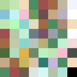
Square Project artwork
Exposure and Shelter
safety vs exposure; pressure_vs_release; split_vertical; echo_right; braid against ripple; pressure_border; thin_vs_heavy; vessel; softness_severity | abstract variation request 424; target batch count 500
- Grid
- 8 x 8
- Cells
- 64
- Colors
- 47
- Record
- 1d124ef7
Artist Statement
The emotional tone captures the tension between safety and exposure, showcasing a pale center against darker borders, illustrating the vulnerability of exposure. The palette combines warm browns and greens suggesting warmth and safety, while colder hues represent the starkness of exposure. The main contrast occurs diagonally, where the safety fades into exposure, creating a visual echo. The chosen patterns of broken dots against fault lines enhance the feeling of rippling pressure. The layout intentionally reserves a negative space, allowing the emotions to breathe.