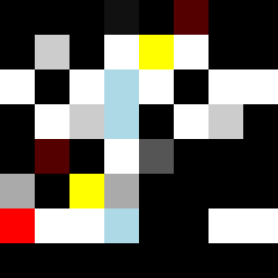
Square Project artwork
Exposure vs Shelter
vulnerability vs strength; symmetry_vs_break; cross_current; braid; flood against stack; pressure_border; fast_vs_slow; tiny_face; desire_emptiness | abstract variation request 488; target batch count 500
- Grid
- 8 x 8
- Cells
- 64
- Colors
- 10
- Record
- 1be27d32
Artist Statement
The emotional tone reflects the tension between vulnerability and strength, using a palette of dark to pale hues to illustrate the stark contrast of a fragile exposed center sheltered by a thick border. The use of black (#000000) and red (#FF0000) anchors the composition with strength, while pale blue (#ADD8E6) and white (#FFFFFF) demonstrate vulnerability and emptiness at the core. The primary collision occurs in the center, where dark tones interrupt the lighter space, creating a visual tension that embodies the seed's concept. The layout of scattered repairs symbolizes the attempts to mend emotional scars, while the broken pixels signify imperfections and interruptions in strength. This composition presents a balanced yet dynamic portrayal of resilience amid fragility, inviting contemplation on the interplay of these states.