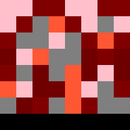
Square Project artwork
Exposure vs. Shelter
vulnerability vs strength; exposure_vs_shelter; rising_signal; outside_inward; flood against spark; hard_edges; thin_vs_heavy; tiny_plus; connection_alienation | abstract variation request 119; target batch count 500
- Grid
- 8 x 8
- Cells
- 64
- Colors
- 6
- Record
- 1a9e3234
Artist Statement
This artwork embodies the emotional tones of vulnerability and strength through a dynamic tension in the color choices and composition. The soft pink (#FFC0CB) representing vulnerability forms a pale center, contrasted sharply by dark maroon (#800000) that denotes strength enveloping this area. This creates a collision of open spaces and heavy blocks, representing the delicate balance between exposure and protection. The patterns of broken dots and crosshatch enhance this theme: the vulnerability emerges as scattered, fragile, while the strength is persistent and structured. The main contrast occurs centrally, symbolizing where these emotional states intersect and influence one another.