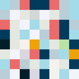
Square Project artwork
Conflict and Harmony
vulnerability vs strength; exposure_vs_shelter; rising_signal; outside_inward; flood against spark; hard_edges; thin_vs_heavy; tiny_plus; connection_alienation | abstract variation request 282; target batch count 500
- Grid
- 8 x 8
- Cells
- 64
- Colors
- 12
- Record
- 189e94d7
Artist Statement
This composition embodies the emotional tension between vulnerability and strength. The palette features pale aqua and mist gray for gentle softness, contrasted sharply by alarm red and ink blue for bold strength. The center pulses with energy, flooded by the sharper tones, echoing the rising signal theme. The edge style creates a jagged feel, symbolizing the hard edges of conflict, while broken pixels disrupt the flow, mimicking scars of past exposures. Each row exhibits a dance of heavy contrasts juxtaposed with lighter hues, representing the interplay between sheltering and exposure, forming a narrative of internal struggle and resilience.