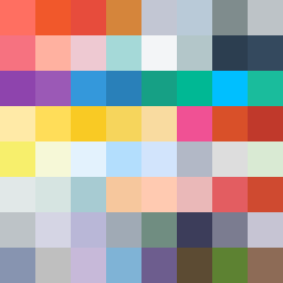
Square Project artwork
Exposure vs Shelter
vulnerability vs strength; light_vs_weight; mirror_broken; sweep; constellation against tide; closed_corners; thin_vs_heavy; horizon; safety_exposure | abstract variation request 38; target batch count 500
- Grid
- 8 x 8
- Cells
- 64
- Colors
- 63
- Record
- 16c758bf
Artist Statement
The emotional tone balances vulnerability and strength, employing a palette of warm and cool colors to evoke feelings of safety and exposure. The chosen colors—hot coral and blood orange for strength, alongside dust pink and hollow blue for vulnerability—collide in the center, highlighting the tension between protecting and exposing. The layout mimics falling pixels, suggesting an emotional descent where the main contrast occurs centrally, presenting a soft core shielded by darker edges that fades into space.