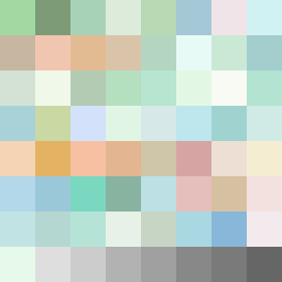
Square Project artwork
Exposure vs Shelter
safety vs exposure; pressure_vs_release; split_vertical; echo_right; braid against ripple; pressure_border; thin_vs_heavy; vessel; softness_severity | abstract variation request 491; target batch count 500
- Grid
- 8 x 8
- Cells
- 64
- Colors
- 64
- Record
- 1556d996
Artist Statement
This artwork explores the emotional tension between safety and exposure through a stark contrast between warm, soft colors representing safety and cooler tones symbolizing vulnerability. The top half of the grid embraces a broken frame pattern in greens and soft browns, evoking a sense of gentle shelter, while the lower half reflects a more open structure with pale skin and open blue tones, characterizing exposed fragility. The central collision lies in the middle row where both emotions clash, creating a visual balance yet emphasizing the push and pull of these contrasting feelings. Broken pixels are strategically placed to represent disruptions in both safety and exposure, simulating emotional scars and vulnerabilities.