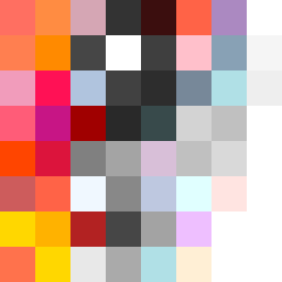
Square Project artwork
Conflict of Serenity
restlessness vs peace; memory_vs_motion; diagonal_argument; edge_crawl; flame against shatter; closed_corners; light_vs_dark; patch; signal_noise | abstract variation request 400; target batch count 500
- Grid
- 8 x 8
- Cells
- 64
- Colors
- 51
- Record
- 1397f3ab
Artist Statement
The emotional tone contrasts restlessness with peace, suggesting an intense push and pull. The palette features vibrant warm colors like hot coral and blood orange to evoke feelings of unrest, juxtaposed with cooler shades like charcoal and hollow blue, representing calm. The main collision occurs at the center with concentrated warm hues interrupting the cooler background, embodying the tension between motion and stillness. Eroded symmetry creates a sense of disbalance, mirroring the chaotic aspect of restlessness while keeping a semblance of peace at the corners.