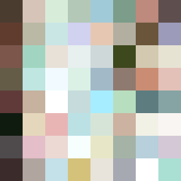
Square Project artwork
Exposure vs Shelter
safety vs exposure; pressure_vs_release; split_vertical; echo_right; braid against ripple; pressure_border; thin_vs_heavy; vessel; softness_severity | abstract variation request 426; target batch count 500
- Grid
- 8 x 8
- Cells
- 64
- Colors
- 63
- Record
- 115448d3
Artist Statement
This artwork embodies the tension between safety and exposure, utilizing a split vertical layout that emphasizes the contrasting emotions. The outer rows are framed with darker, muted colors, representing the protective safety dome, whereas the inner section features lighter, more vibrant hues to signify exposure and vulnerability. The combination of the sheltering browns and greens with the airy blues creates a dialogue of warmth and vulnerability. The edge style is a burned effect, indicating wear and imperfection while breaking from uniformity to enhance emotional depth. The collision occurs primarily at the center, where soft ripples of blue and skin tones face the weighty brown, encapsulating the balance of pressure and release in this abstract representation.