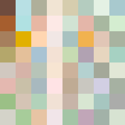
Square Project artwork
Exposure vs Shelter
safety vs exposure; pressure_vs_release; split_vertical; echo_right; braid against ripple; pressure_border; thin_vs_heavy; vessel; softness_severity | abstract variation request 392; target batch count 500
- Grid
- 8 x 8
- Cells
- 64
- Colors
- 64
- Record
- 10afcb51
Artist Statement
The emotional tone highlights the tension between safety and exposure. The palette includes soft greens and warm browns to evoke a sense of shelter, while pale tones create the feeling of vulnerability. The main collision occurs through a gradient from the warm brown in the corner spreading across to the lighter shades, suggesting a boundary that is being both maintained and crossed. Broken pixels are incorporated to reflect imperfections in the idea of shelter, mirroring reality's unpredictability. The layout emphasizes a corner invasion that creates a sense of tension as safety permeates through exposure.