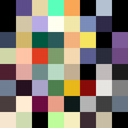
Square Project artwork
Resilience in Contrast
vulnerability vs strength; exposure_vs_shelter; rising_signal; outside_inward; flood against spark; hard_edges; thin_vs_heavy; tiny_plus; connection_alienation | abstract variation request 355; target batch count 500
- Grid
- 8 x 8
- Cells
- 64
- Colors
- 56
- Record
- 0f5d9c14
Artist Statement
The emotional tone revolves around the interplay between vulnerability and strength. The palette was chosen for its dual nature, featuring dark violet to signify strength contrasted with soft gold representing vulnerability. The collision of patterns occurs centrally, where lattice-like structures clash with soft stripes, symbolizing the tension between protection and exposure. The layout creates an island of intensity amidst a tranquil sea, embodying the struggle of maintaining safety in a chaotic world.