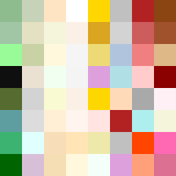
Square Project artwork
Rise vs Fall
restlessness vs peace; memory_vs_motion; diagonal_argument; edge_crawl; flame against shatter; closed_corners; light_vs_dark; patch; signal_noise | abstract variation request 436; target batch count 500
- Grid
- 8 x 8
- Cells
- 64
- Colors
- 57
- Record
- 0f5b0a38
Artist Statement
The emotional tone captures a conflict between restlessness and peace, conveyed through the color palette of moss green, bone white, rust, stone gray, and small gold. The layout splits horizontally, embodying the contrast where the top part represents restlessness with dynamic dots creating an uneven pulse, while the bottom reflects peace through a mirror pattern, creating a serene but imperfect symmetry. The main collision occurs in the middle, where these two emotional patterns interact, signifying the tension between memory and motion. Broken pixels introduce intentional imperfections, enhancing the sense of disruption and unresolved feelings, while the color arrangements create a rhythm of rising tension in the top rows, followed by a calming descent in the lower rows.