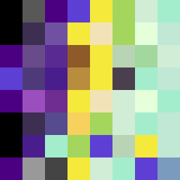
Square Project artwork
Near vs Far
restlessness vs peace; memory_vs_motion; diagonal_argument; edge_crawl; flame against shatter; closed_corners; light_vs_dark; patch; signal_noise | abstract variation request 338; target batch count 500
- Grid
- 8 x 8
- Cells
- 64
- Colors
- 29
- Record
- 0f523ff4
Artist Statement
This composition captures the tension between restlessness and peace through a dynamic color palette and layered patterns. The dark hues signify a restless undertone, while the soft gold offers moments of peace. The collision occurs diagonally, suggesting upward movement (hope) alongside the quiet pulling motion of darker tones. The arrangement reflects a 'rising signal' where colors spark and mirror each other, allowing for a gentle oscillation in emotional tone. The broken pixels add unexpected disruptions, creating a sense of imperfection and the complexity of memory versus motion.