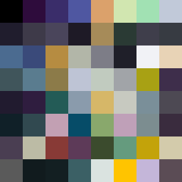
Square Project artwork
Fractured Harmony
confusion vs clarity; symmetry_vs_break; falling_pixels; pulse; crosshatch against noise; thick_outline; symmetrical_vs_broken; tiny_face; rage_calm | abstract variation request 116; target batch count 200
- Grid
- 8 x 8
- Cells
- 64
- Colors
- 64
- Record
- 0e17bcf9
Artist Statement
The emotional tone fluctuates between clarity and confusion, mirroring the uncertainties of life. The chosen palette of black, dark violet, soft gold, and pale green reflects a balance of fear and hope—black and violet create depth and tension, while gold and green introduce brightness and potential resolution. The straight vs. curved contrast manifests through the arrangement of darker and lighter colors that zigzag, signifying the pulse of chaotic emotion. The patterning incorporates 'mirror' for confusion and 'noise' for clarity, depicting a duality where one side feels broken while the other strives for symmetry. The incorporation of broken pixels adds an imperfection that encourages introspection on the nature of these oppositions.