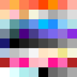
Square Project artwork
Exposure vs Shelter
restlessness vs peace; memory_vs_motion; diagonal_argument; edge_crawl; flame against shatter; closed_corners; light_vs_dark; patch; signal_noise | abstract variation request 334; target batch count 500
- Grid
- 8 x 8
- Cells
- 64
- Colors
- 52
- Record
- 0dc93ccc
Artist Statement
This artwork captures the tension between restlessness and peace, expressed through a contrasting palette of warm corals and cool slates. The central area is heated with warm colors representing restlessness, while the periphery fades into cool tones, encapsulating peace. The arrangement of colors creates an interrupted flow, with a dominant warm section colliding with cooler hues, suggesting movement and stillness interspersed across the canvas. The broken pixels serve as intentional disruptions, adding texture and a sense of imperfection, mirroring the emotional complexity of memories that clash with a yearning for tranquility.