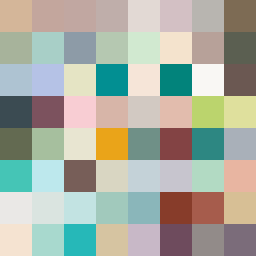
Square Project artwork
Exposure vs Shelter
safety vs exposure; pressure_vs_release; split_vertical; echo_right; braid against ripple; pressure_border; thin_vs_heavy; vessel; softness_severity | abstract variation request 365; target batch count 500
- Grid
- 8 x 8
- Cells
- 64
- Colors
- 64
- Record
- 0d5f8072
Artist Statement
The emotional tone oscillates between vulnerability and protection, reflecting the tension of exposure against safety. The color palette of warm brown and shelter green embodies safety, complemented by the cold white of exposure, creating a stark contrast. The composition divides the square vertically with warmer hues on one side, representing safety as a static barrier, while the cooler hues symbolize exposure as a fluid thread weaving through the pattern. The chosen design features intentional disruptions—broken pixels, scattered in the form of cold white and pale skin—suggesting fragility and moments of vulnerability within the protective embrace of warm brown and shelter green. Such interruptions convey a feeling of unease and dislocation, forming a narrative that embodies the tension within the seed text.