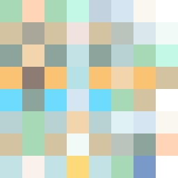
Square Project artwork
Exposure and Shelter
safety vs exposure; pressure_vs_release; split_vertical; echo_right; braid against ripple; pressure_border; thin_vs_heavy; vessel; softness_severity | abstract variation request 287; target batch count 500
- Grid
- 8 x 8
- Cells
- 64
- Colors
- 26
- Record
- 0bf241e5
Artist Statement
The emotional tone captures the delicate balance between safety and exposure. The palette combines 'shelter green' for a protective feel, 'pale skin' for vulnerability, and 'open blue' for exposure, creating a soft tension. The main collision occurs in the center, where dark 'warm brown' interrupts the lighter hues, emphasizing the contrast between security and risk. The arrangement uses diagonal flow to suggest a descent, with interrupted clusters mimicking the rhythm of tears or raindrops, resonating with the seed’s themes of pressure and release.