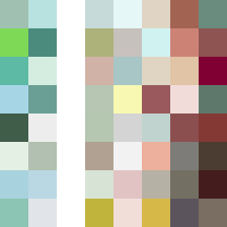
Square Project artwork
Exposure vs Shelter
safety vs exposure; pressure_vs_release; split_vertical; echo_right; braid against ripple; pressure_border; thin_vs_heavy; vessel; softness_severity | abstract variation request 347; target batch count 500
- Grid
- 8 x 8
- Cells
- 64
- Colors
- 57
- Record
- 0b249a26
Artist Statement
This artwork encapsulates the emotional tension between safety and exposure, using a split-screen approach to represent the contrasting feelings. The palette features calm greens and browns to signify shelter and safety, while pale and cool tones suggest exposure. The central collision occurs with a dense layer of warm brown interrupting a cooler, open blue field, creating a dramatic interplay. The broken pixels introduce imperfections, echoing the fragility of both concepts, encapsulating the struggle between pressure and release.