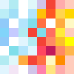
Square Project artwork
Rise vs Fall
restlessness vs peace; memory_vs_motion; diagonal_argument; edge_crawl; flame against shatter; closed_corners; light_vs_dark; patch; signal_noise | abstract variation request 258; target batch count 500
- Grid
- 8 x 8
- Cells
- 64
- Colors
- 34
- Record
- 0933ff9e
Artist Statement
This artwork encapsulates the emotional tension between restlessness and peace through a carefully curated palette of serene and urgent colors. The lighter tones of pale aqua and mist gray represent a sense of calm, while the alarm red and ink blue introduce fluid unease, creating a dynamic where one side evokes stillness and the other, motion. The diagonal layout captures the push and pull between these themes, with the red and blue weaving through the composition, representing disruption and pulse against the soft lattice of the serene colors. The central collision of colors—where the emotions intersect—conveys the tension between these opposing feelings, making the viewer feel the weight of unresolved conflicts and moments of serenity simultaneously.