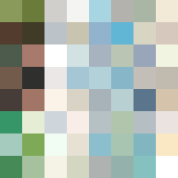
Square Project artwork
Exposed Harmony
safety vs exposure; pressure_vs_release; split_vertical; echo_right; braid against ripple; pressure_border; thin_vs_heavy; vessel; softness_severity | abstract variation request 408; target batch count 500
- Grid
- 8 x 8
- Cells
- 64
- Colors
- 63
- Record
- 06dbe142
Artist Statement
This composition captures the emotional conflict between safety and exposure through the use of a protective lattice frame surrounding a pale, open center. The palette of shelter green and warm brown signifies comfort and warmth, contrasted against the cold white and open blue that reflect vulnerability and exposure. The primary collision occurs at the edges, where warm and cool colors intermingle, creating a tension that represents the ongoing struggle between shelter and openness. This arrangement amplifies the sense of fracture and reaction across the square, embodying the theme of the seed while maintaining an abstract visual narrative.