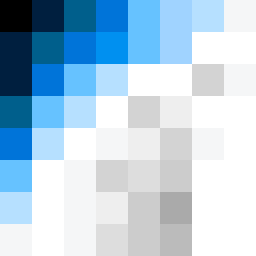
Square Project artwork
Exposure vs Shelter
vulnerability vs strength; symmetry_vs_break; cross_current; braid; flood against stack; pressure_border; fast_vs_slow; tiny_face; desire_emptiness | abstract variation request 472; target batch count 500
- Grid
- 8 x 8
- Cells
- 64
- Colors
- 16
- Record
- 05fb20f7
Artist Statement
This artwork captures the emotional tension between vulnerability and strength through contrasting color placements. The outer border of deep blues and black represents strength—a dense, protective boundary. In contrast, the inner area utilizes pale yellow and softer greens, symbolizing vulnerability and openness. The collision occurs near the center, where pale hues bleed into the strong frame, suggesting a push against boundaries. The deliberate broken pixels create subtle disruptions in the calm center, echoing the feelings of exposure and fragility, while the overall frame structure ensures clarity and balance. This reflects the delicate interplay between safety and exposure, drawing on the seed's themes of tension and contrast.