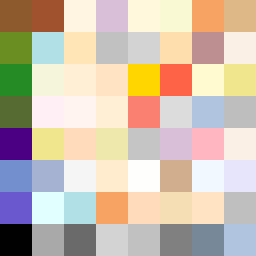
Square Project artwork
Exposure vs Shelter
safety vs exposure; pressure_vs_release; split_vertical; echo_right; braid against ripple; pressure_border; thin_vs_heavy; vessel; softness_severity | abstract variation request 328; target batch count 500
- Grid
- 8 x 8
- Cells
- 64
- Colors
- 53
- Record
- 05afb22f
Artist Statement
This piece juxtaposes the concepts of safety and exposure through color contrasts and patterns. The palette includes warm brown and shelter green representing safety, while the pale skin and open blue evoke vulnerability. The center of the artwork suggests a fragile balance, with a dense cluster of darker colors creating a border that feels protective but also closed. The light colors in the center contrast with the heavy borders, highlighting the tension between exposure and shelter. The patterns of dots (safety) collide with islands (exposure) around the center, with subtle broken pixels introducing intentional irregularities mirroring emotional complexity. This arrangement aims to invoke the feeling of navigating safety amidst vulnerability, embodying the duality of experience.