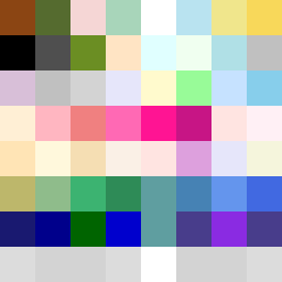
Square Project artwork
Exposure and Shelter
safety vs exposure; pressure_vs_release; split_vertical; echo_right; braid against ripple; pressure_border; thin_vs_heavy; vessel; softness_severity | abstract variation request 279; target batch count 500
- Grid
- 8 x 8
- Cells
- 64
- Colors
- 52
- Record
- 02c8df5b
Artist Statement
This composition represents the emotional tension between safety and exposure, using a palette that speaks to vulnerability and protection. The warm brown and shelter green suggest stability and safety, while the pale skin and open blue evoke feelings of vulnerability and openness. The collision occurs in the central band, where the color warm brown meets open blue, creating visual tension and echoing the themes of pressure versus release. The use of broken pixels introduces intentional imperfections, symbolizing the fraught nature of safety and exposure—neither state is entirely secure or completely free. The pattern of stacked bands reflects layers of emotion, shifting from stable, protective colors at the top to lighter, more vulnerable tones below, resonating with the overarching theme of exposure versus shelter.