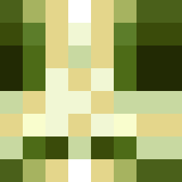
Square Project artwork
Exposure vs Shelter
vulnerability vs strength; symmetry_vs_break; cross_current; braid; flood against stack; pressure_border; fast_vs_slow; tiny_face; desire_emptiness | abstract variation request 230; target batch count 500
- Grid
- 8 x 8
- Cells
- 64
- Colors
- 11
- Record
- 0144a469
Artist Statement
The composition captures the juxtaposition of 'vulnerability' and 'strength' through the use of a light palette in the center, representing exposure, surrounded by deeper, richer colors that signify strength. The use of colors like honey gold and cream suggest lightness and fragility, while deep olive creates a grounding effect. The central collision occurs at the core, where light meets dark, suggesting a struggle between protection and exposure, creating a dynamic and engaging visual narrative. The arrangement presents clear boundaries interrupted by delicate broken pixels, symbolizing imperfections in both strength and vulnerability.