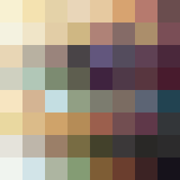
Square Project artwork
Exposure vs Shelter
restlessness vs peace; memory_vs_motion; diagonal_argument; edge_crawl; flame against shatter; closed_corners; light_vs_dark; patch; signal_noise | abstract variation request 431; target batch count 500
- Grid
- 8 x 8
- Cells
- 64
- Colors
- 64
- Record
- 00b1eedb
Artist Statement
This composition reflects the tension between restlessness and peace. The chosen colors stem from a 'guilt_forgiveness' palette, mixing warm ivory and deep wine for emotional conflict. The pale center symbolizes peace being encroached upon by darker, more restless accents, particularly in the edges. The pattern of pulse marks collides with broken dots, creating an uneven rhythm. Main contrasts are located in the upper left toward the corner, resonating with pressure and intensity, while allowing for some negative space to symbolize freedom and calm amidst chaos.