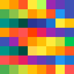
Square Project artwork
Exposure vs Shelter
vulnerability vs strength; light_vs_weight; mirror_broken; sweep; constellation against tide; closed_corners; thin_vs_heavy; horizon; safety_exposure | abstract variation request 215; target batch count 500
- Grid
- 8 x 8
- Cells
- 64
- Colors
- 24
- Record
- 00628775
Artist Statement
This artwork explores the emotional duality between vulnerability and strength. The palette features warm hues of orange and yellow to represent strength, contrasted by cooler, muted purple and deep blue to signify vulnerability, creating tension. The central area, composed of lighter tones, symbolizes an exposed core, while the darker edges create a protective frame. A 'hinge' pattern of warm colors intersects with a 'lattice' of cooler tones, disrupting the flow and intensifying the narrative of protection versus exposure. The flow spirals clockwise, giving a dynamic movement that echoes the internal struggle between feeling safe and feeling open. Broken pixels introduce imperfection, enhancing the abstract story.